Consulting, Development, Microsoft Dynamics AX
Tutorial: Understanding the Simple List & Details form within Dynamics AX 2012r2 Part 3
 16805
16805 
Apr
Look, there is a part 3 but why. The reason for this is because we need to go further with forms. I’ve decided to make this a 5 part series where we will jump into code and review best practices. Poor form development is a ‘No-No’. Good Form Development will make you look like a hero! This tutorial requires that you do Part 1 & 2 of this series first and have the project up and ready for action. We do some navigation building in this part and explore the ActionPane — that region that appears on the top of the form as a menu strip. This functions like the ribbon in Microsoft Office. Let’s customize it a little.
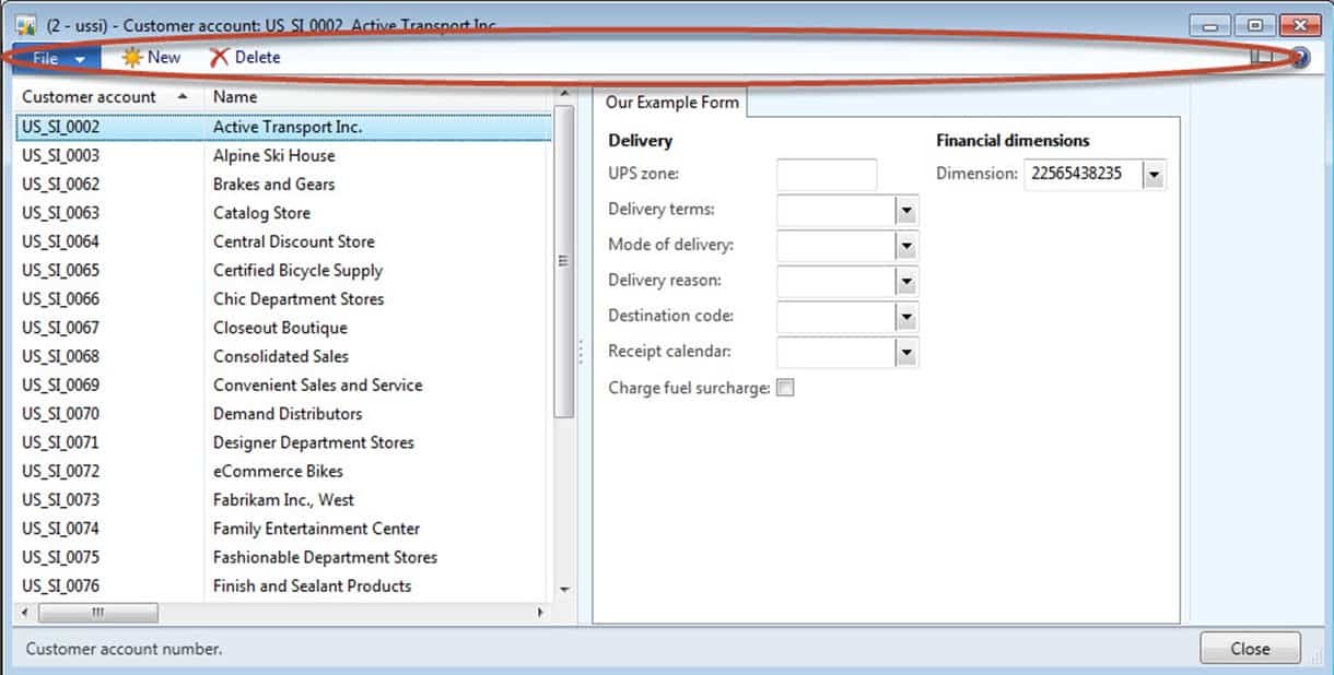
- Open up your DemoListDetailForm project that you had finished in Part 2. Notice that the ActionPane which is circled doesn’t have many options. There is a new and delete button because we bound it to a data source. Let’s do more with this action pane and add some buttons to it.
-
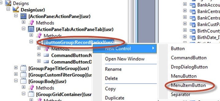
Expand the [ActionPaneTab:ActionPaneTab](usr), and then right-click on [ButtonGroup:RecordBasics](usr) and left-click on MenuItemButton. You were presented with 6 different options here. These are controls that you can add to the menu. For those of you new to the concept of a control, think of this as a graphical component that does a bunch of stuff without you having to code. You can still use code with them, but the idea is to reduce the amount of code because they do so much on their own. You are presented with 6 controls for the [ButtonGroup:RecordBasics](usr). Choose the MenuItemButton. MenuItemButton will be the most common control that you pick.
STOP!!!!!!!!!!!!!! Something very, very important is to walk out with a good understanding of what these controls do! You will use these again and again, and they will become especially important with security. See the table listed below to understand the controls.
ActionPane Control Purpose Button Has a clicked method that works like the clicked event in other languages. Use this for maximal flexibility when you want something to happen when the user clicks on a button. You decide on what you want to happen by overriding the click method. CommandButton Like a button except that you have built in commands that you often won’t customize. For example, one command is called “new”. It literally creates a new record against the data source table. Actions like those rarely need customization, so why not just have a quick and easy way to create them? With the commandButton, we change a quick setting and we are in business. DropDialogButton Sometimes, users need a small form to popup when they click a button. You can think of this like the irritating popups on websites except that hopefully, you aren’t irritating your users. You link to the small form when you click this control which looks like a button. MenuButton Careful not to get this mixed up with the “menu.” Menus are those page options that appear when people open up a client module like Accounts Payable Area Page. They are meant more for modular navigation than form navigation. Menu Buttons are groups of organized buttons that give us the ability to sort our buttons in groups. So we could use a menu button control to organize 4 different buttons (menu item) that each open a different form page. MenuItemButton “The King of the North” if you watch Game of Thrones. This is the most commonly used button. It’s main purpose is to provide links and respect built in security. So when a user clicks on it, we will often launch a form or a report. The button only works if the user has the permissions for it to work. Seperator Usually, you will place a nice little vertical line between groups of related buttons on your action Pane to make things look nicer. Users will usually fiddle around with that vertical separator (which looks just like a vertical line) until they find the look that they like. -
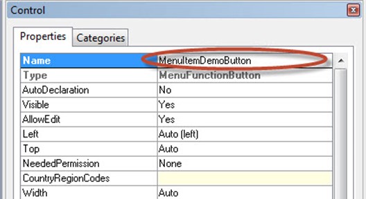
Go to the properties window of the newly created MenuItemButton control. Change the name of the control to MenuItemDemoButton.
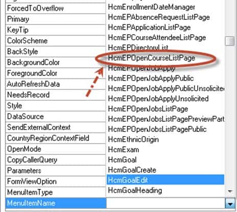
- Now, go further down the properties list where you see MenuItemType and MenuItemName. Using the drop-down select the MenuItemName property and select HcmEPOpenCourseListPage. Note, I just picked some ListPage(a page with a bunch of records listed on it) to demonstrate linking functionality. By the way, notice the MenuItemType property above it. There are 3 settings that you can choose from.
| MenuItem Types | What they Do |
| MenuItemType: Display | This should be used to launch forms |
| MenuItemType: Action | This should be used to launch classes |
| MenuItemType: Output | This should be used launch reports |
At any rate, here is a screenshot showing you what should be selected.
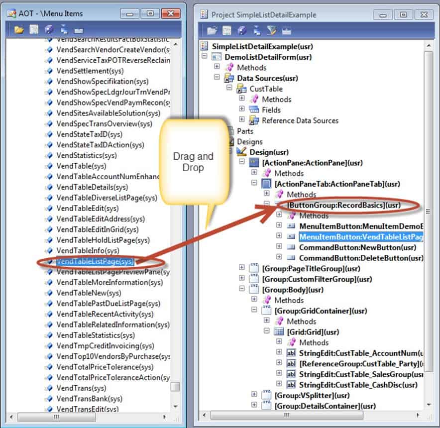
7. Congrats, you’ve added one menu item to the ActionPane, but let’s see another way. With 2 windows open, drag the MenuItem VendTableListPage over from the Menu Items/Display node over to the [ButtonGroup:RecordBasics](usr). Notice how it autopopulates a menu item in the [ButtonGroup:RecordBasics](usr) for you.
8. Save the menu item and compile it as you learned to do in the previous two exercises. Then, preview the form by clicking on DemoListDetailForm and clicking open.
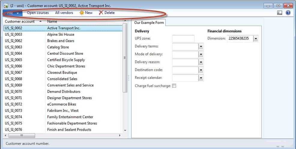
And Presto!!! We are done with Part 3. Now, you learned some very important things in this lab. Note: there will be a Part 4 and 5. In Part 5, we dive into code and begin to gain an understanding of how the Dynamics Forms coding framework really works and some things that we should do.

