Microsoft Power BI Series
Power BI Data Visualization Best Practices Part 6 of 15: Multi-Row Cards
When it comes to understanding data to its fullest, there is an absolute need to rely on powerful tools for illustration. Multi-Row cards in Power BI are an excellent strategy to illustrate your data in a simple way. Visual-oriented ways for easier understanding are our step into the technology-driven era we live in, and it is imperative to learn the designated skills in today’s world. Looking at numbers and raw, complicated data may hinder the overall efficiency of your business, which is why it is easier to have accessible, organized data which creates a feeling of connection between the hierarchy.
To understand and connect better with our business, therefore, we need to have a firm grasp on all of its operations and derive performance-driven reports to assess productivity. Tools such as Power BI help us in performance, and we are going to explore more on Data Visualizations and their effectiveness in creation and configuration. To continue with our Power BI Series, we will focus on understanding the basics about Multi-Row Cards and how to configure our own using Power BI.
Here is an overview for your reference:
- Card visualizations in Power BI
- What are Multi-Row cards in Power BI?
- Best uses for Multi-Row Cards in Power BI?
- How to set up Multi-row card using Power BI?
- Pros and Cons of Multi-Row Cards in Power BI
- What is data visualization?
- Why is data visualization important?
- What are the benefits of data visualization?
- How to start data visualization with Power BI?
- Conclusion
To start talking about Multi-row cards, we need to first elaborate on Card Visualizations.
Card Visualizations in Power BI
Card visualizations are used to track and display data in a summarized form. It can be your total sales, the market shares, net profit or any other accounted element of your business that needs to be emphasized. With this type of visualizations you can display the data in a single form or in a group form. That’s when the two types of Cards in Power BI come into action.
There two types of cards in Microsoft Power BI:
Single Number Cards
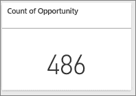
These types of cards can be created using the report editor or Q&A. They are used to display a single number as shown below:
Multi-Row Cards
These types of cards are used to display data in a group format or a section as you can see in the picture below: This being said,let’s further take a look into the Multi-Row Card visualization type.

What Are Multi-Row Cards in Power BI?

Multi-Row cards are a card visualization type in Power BI that allows you to group and display values in a summarized form. Single number are great when you need to display a single value, but if you need to present multiple values, then the Multi-Row Card is your way to go. These types of cards are used to present amounts or a set of figures independent of other references.
For example, this Multi-row card shows the money raised in sales, the target, the variance and the margin of variance.

Depending on what the business wants, the data can show relevant information that needs to be highlighted and separated from the other references. You can show the money that was collected from the sales of certain products categories. In general, these types of visualizations are more goal-oriented, as they show the status of certain data, not only through multiple rows, but also through multiple columns.
SUMMARY: There are two types of card visualizations in Power BI
- Standard Cars
- Multi-Row Cards
- They are both used to display values in a single format form
- Multi-Row cards are used to display the information in a group form or section in summarized way
Best Uses for Multi-Row Cards
How can you make the most out of such a simple visualization?
The thing with Multi-Row Cards or Single Number Cards is that they are so plain that there is not much to do with them, on their own. But despite being son simple, they can be very useful for making awesome statements on top of your reports or dashboards. As mentioned before, they are great to show the status of a process, or a goal. Which helps a lot to boost the decision making process of your business.
For example, when there is not much time to read and interpret charts and graphs, having the summarized results on a set of cards work wonders to make a quick decision. Multi-Row Cards are like the punch line of a phrase. They complement the data out of other visualizations to make the final statement. So, another way to use them is to complement charts and other visuals in order to emphasized relevant information in the different the categories that form this visuals. Now, let’s see how you can set up your own Multi-row cards in Power BI.
How to set up a Multi-Row card using Power BI?
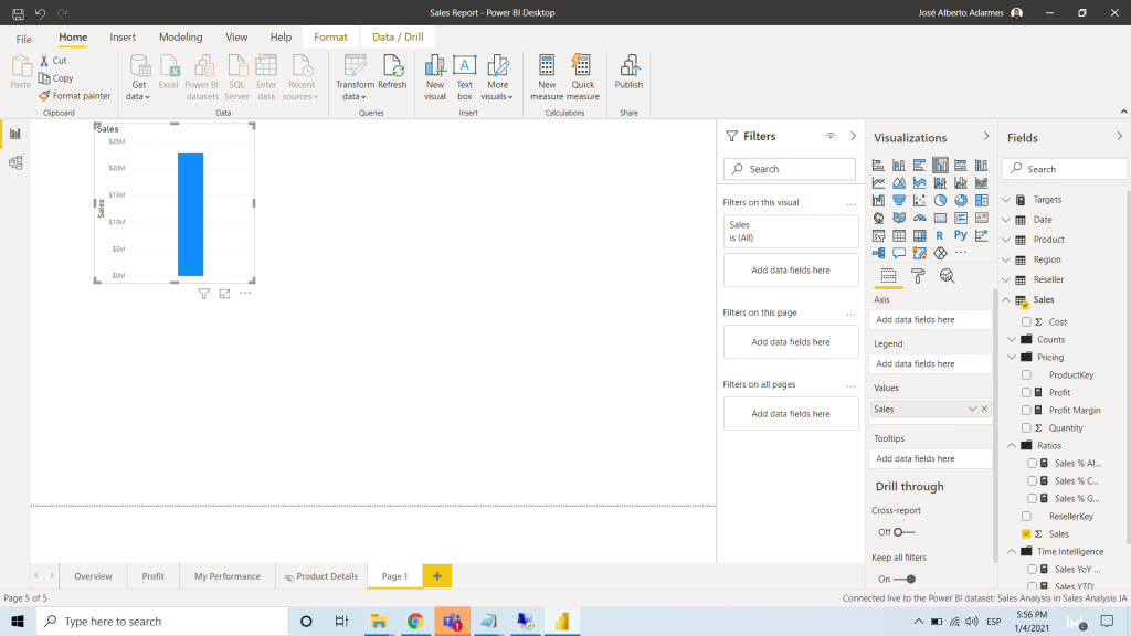
STEP 1: Create a column chartFirst, drag and drop the ”Total Sales” from the Fields section to the “Canvas” section to automatically create a Column Chart. |
 |
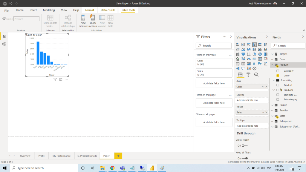 |
STEP 2: Add the color fieldAfter creating a column chart, you need to add the “Color field” to the “Axis field”. This will create a column chart that will show the “Sales Amount” by the product Color: |
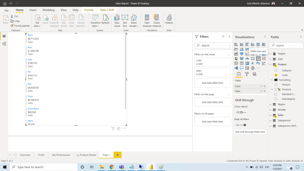
STEP 3: Create the Multi-Row cardLastly, click on the Multi-Row Card under the Visualization section to automatically convert the Column Chart into a Multi-Row Card. |
 |
Alternative way to set up a Multi-row Card:
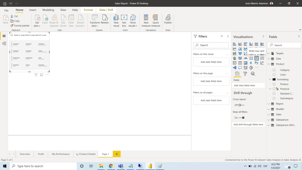
STEP 1: Create a Multi-Row Card with dummy dataFirst, click on the “Multi-Row Card” under the “Visualization” section to create a Multi-Row Card with dummy data. |
 |
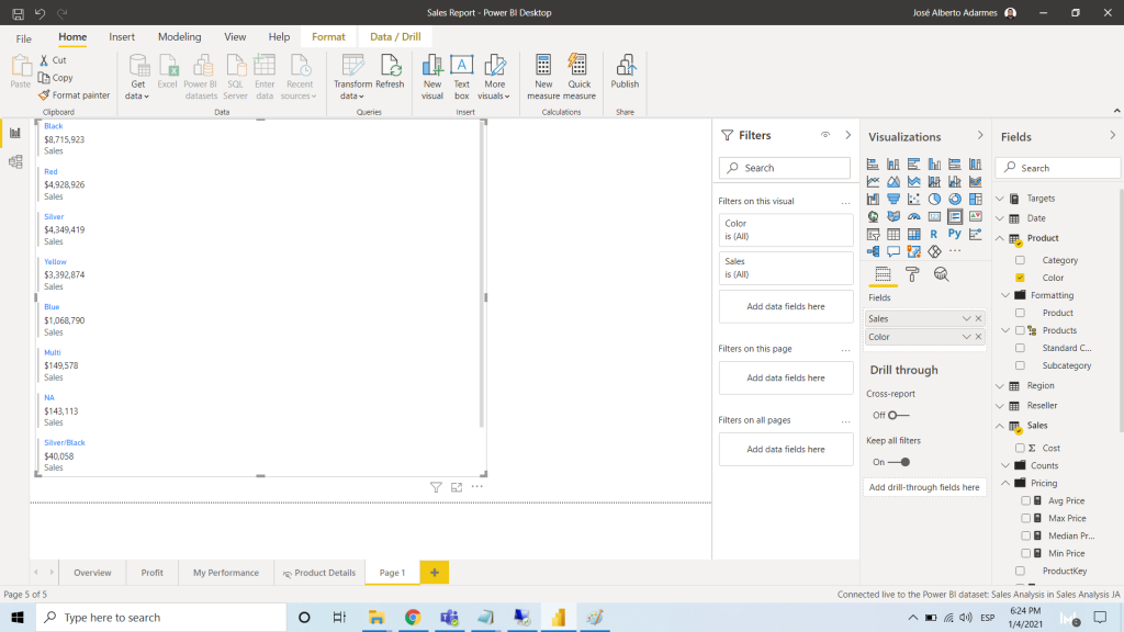 |
STEP 2: Create the Multi-Row CardDrag and drop the “Product Color” and “Total Sales” to Fields section. This will create a Multi-Row Card with the Product Color and Total Sales: |
STEP 3: Format the Multi-row CardTo format your Multi-row card, you need to click anywhere on the card and go to the Format section. In the Format Section, you will find the following properties to format the Multi-row card according to Size, Color and Font Type: |
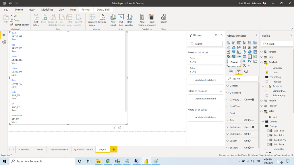 |
- General: In this field you can manage the dimensions of the card. For example: the height, width, the X axis and the Y-axis position
- Title: you can add any title to the card and change the font style, the background color, etc.
- Data label: With this you can change the font color and font size
- Category: With this, you can change the font style and hide the column name of the card
- Background color: You can use this section to change the color of your Multi-row card background
- Border: With this property you can change the border to the card and its color
Pros and Cons of using Multi-Row Cards
Pros of Multi-Row Cards:
- They can summarized relevant information in a group form
- As they show the most relevant information, they can help to boost the decision making process in a business
- They align automatically
- They complement other visuals to make an statement
Cons of Multi-Row Cards:
- They don’t show in depth detailed data
- Unlike Single Number Cards, Multi-Row Cards cannot be used to set alert in Power BI Service
- Now, before wrapping things up, let’s talk about Data Visualization and its importance
What is Data Visualization?
Microsoft states that: “ Data Visualization brings data to life, making you the master storyteller of the insights that are hidden within your numbers.”
This holds a lot of truth, because businesses’ today, generate tons of data. Marketing performance, Sales revenue, Customer interactions, Inventory, Production metrics and costs; the KPI’s are endless.As the numbers keep on accumulating, data processing must be done in an organized fashion to present insights that are easily understood. Data visualization, therefore, acts as a graphical representation and contextualization of raw data. In other words, you are a translator and the data is the foreign language that you need to convert so that everyone understands the message.
Why is Data Visualization Important?
Data visualization is essential to understand as it allows you to analyze what is happening within the business. It allows you to explore trends and clusters, unusual patterns, output a lot more about business processes. With the collected information and the respective graphic elements, it is easier to put together a strategy adapted to the current necessities, as it is simpler to spot patterns in a visual summarized form. Making the most out of your data is how you get the insights. Imagine, for a second, that you have to explain numbers, facts and figures in spreadsheets and excel at the company meeting. This is why Data Visualization is important.
What are the Benefits of Data Visualization?
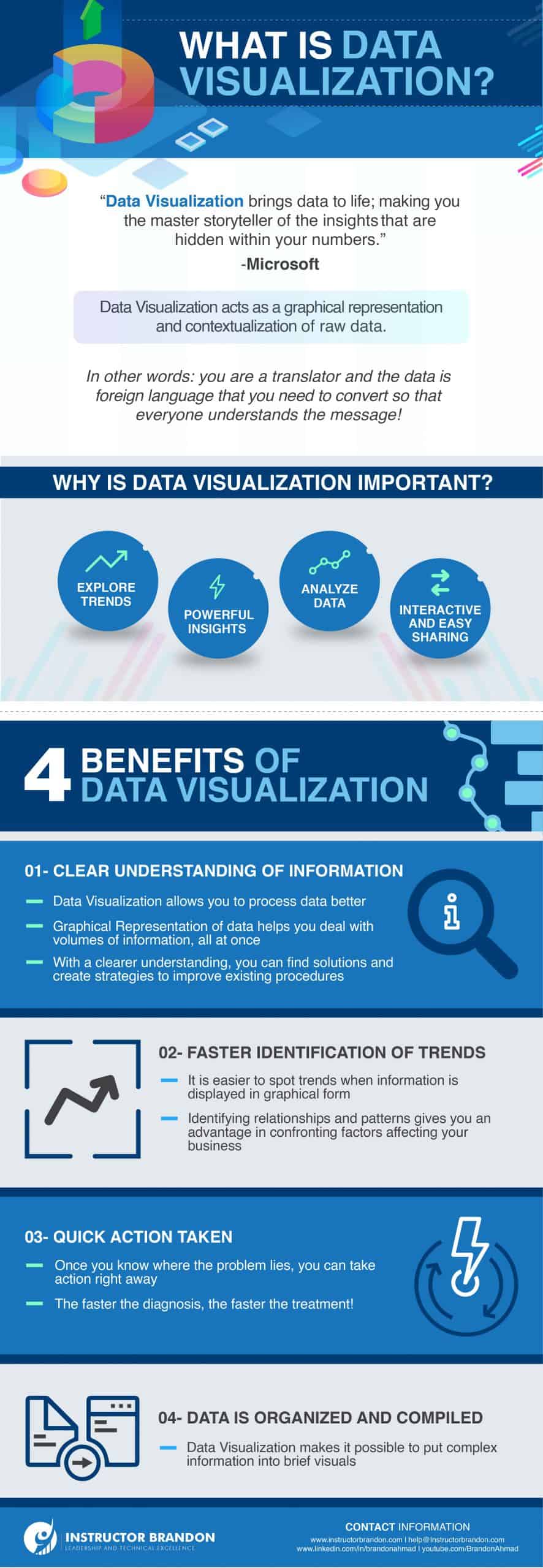
There are potential benefits of Data Visualization, and we have a list for you:
1. Clear understanding of information
Data visualization allows you to process data better, if we keep things simple. With a clear understanding of information, you can work on finding solutions and creating strategies to improve your business operations.
2. Faster identification of trends
It is easier to spot trends when information is displayed in graphic form. Identifying relationships and patterns gives you an advantage to confront activities and complications that might be affecting your business’ overall performance.
3. Quick action
Once you know where the problem lies or is going to be in the future (remember data analysis can give you powerful insights of everything that has been happening in the business –past, present and even future-), you are capable of working on solutions and taking action right away.
4. Compiles information
Data visualization makes it possible to encapsulate complex information in a brief visual. These were the benefits of Data Visualization; and we will now move on to Data Visualization in Power BI and how it’s even more effective.
SUMMARY: Data visualization is the graphic representation of raw data. It helps you to:
- Understand all the collected information and come up with useful insights
- Identify trends and patterns within your business processes
- Take action and find solutions
- Have all the information compiled and summarized in one place
How to start Data Visualization with Power BI?
Starting Data Visualization with Microsoft Power BI is not as technical as you would think. Power BI offers an intuitive/user friendly platform that allows you to create impact visuals.
Let’s start with the basics.
Power BI has a Power BI Desktop Application and a Power BI Online Cloud Service:
| POWER BI | ||
| FUNCTIONALITY | POWER BI DESKTOP | POWER BI CLOUD SERVICE |
| ORGANIZE DATA, COMBINE DATA, ADD OR DELETE COLUMNS, MODIFY TABLES | YES | YES |
| CREATE VISUALS | YES | YES |
| CREATE REPORTS | YES | YES |
| CREATE DASHBOARDS | NO | YES |
| SHARE DASHBOARDS AND REPORTS | NO | YES |
Click here to get inspired and create your own dashboards
Note: Keep in mind that you cannot create a Dashboard and share it using the desktop application
The first thing you need in order to use this platform is to provide your business email. Take into consideration that you cannot use a commercial email addresses like Gmail; if you have office 365, you can use your credentials. You can connect with several data sources: from Excel spreadsheets to streaming data and cloud services like Google Analytics. Once you have your Data source, you can reshape it so it fits to your needs and you can present it in the way you want. Power BI allows you to create a lot of different visuals; one of those, and the one we are focusing on in this part of the series is the Multi-row card visualization.
Click here to learn more about Power BI and master the basics of this Microsoft Platform.
Conclusion:
As is evident in this part of our Power BI series, Multi-Row Card Visualizations present things in a simple way. They are used either to get a faster insight into business reports or to make up a quick judgment about a decision. Learning to present your information can be a game changer for your business tactics. Managing tools with Power BI is possible, given the right training experience. Here, at Instructor Brandon, we are dedicated to give you the training you need for mastering your Power BI skills.
We count on our dedicated support team to help you with anything you need, along with your online training preferences. If you are interested in learning more about the Power BI Platform, feel free to Contact Us for queries. And as always, you are welcome to leave us a comment in the section below.
[sc_fs_multi_faq headline-0=”h2″ question-0=”What are Card Visualizations in Power BI?” answer-0=”Card visualizations are used to track and display data in a summarized form. It can be your total sales, the market shares, net profit or any other accounted element of your business that needs to be emphasized. With this type of visualizations you can display the data in a single form or in a group form. That’s when the two types of Cards in Power BI come into action.” image-0=”” headline-1=”h2″ question-1=”What is Data Visualization?” answer-1=”Microsoft states that Data Visualization brings data to life, making you the master storyteller of the insights that are hidden within your numbers. This holds a lot of truth, because businesses’ today, generate tons of data. Marketing performance, Sales revenue, Customer interactions, Inventory, Production metrics and costs; the KPI’s are endless. As the numbers keep on accumulating, data processing must be done in an organized fashion to present insights that are easily understood. Data visualization, therefore, acts as a graphical representation and contextualization of raw data. In other words, you are a translator and the data is the foreign language that you need to convert so that everyone understands the message.” image-1=”” headline-2=”h2″ question-2=”Why is Data Visualization Important? ” answer-2=”Data visualization is essential to understand as it allows you to analyze what is happening within the business. It allows you to explore trends and clusters, unusual patterns, output a lot more about business processes. With the collected information and the respective graphic elements, it is easier to put together a strategy adapted to the current necessities, as it is simpler to spot patterns in a visual summarized form. Making the most out of your data is how you get the insights. Imagine, for a second, that you have to explain numbers, facts and figures in spreadsheets and excel at the company meeting. This is why Data Visualization is important.” image-2=”” count=”3″ html=”true” css_class=””]
 49912
49912 