Microsoft Power BI Series
Power BI Data Visualization Best Practices Part 9 of 15: Funnel Charts
In business and sales, the ‘Funnel Charts’ are often used as the data visualization that explains the different stages of the sales process. As you find yourself constantly wanting to buy something, you become part of a funnel without even realizing it.
In this part of our Power BI Data Visualization Series we are going to walk you through Funnel Charts in Power BI.
The realization that we live in a world of funnels every time we are online suggests that we are constantly moving around funnels. As is the case with any other visual, we need to figure out how to use Funnel Charts accurately. There are a few aspects that you should consider to create Funnel Charts.
Let’s move on in our Series.
In this article we are going to cover the following topics:
- What are Funnel Charts?
- How do Funnel Charts work?
- Best uses for Funnel Charts
- When to use a Funnel Chart?
- Best Practices for creating Funnel Charts
- How to Create a Funnel Chart in Power BI?
- Pros and Cons of Funnel Charts
What are Power BI Funnel Charts?

A Funnel Chart is a Data Visualization type in Power BI that shows the flow of processes. This visual is more commonly used by sales departments and businesses to represent and analyze the different stages of certain processes (i.e. the Sales Process).
The name ‘Funnel’ comes from their characteristic (funnel shape or inverted pyramid), if we see them from a design perspective. This shape allows them to display values decreasing in proportion, similar to the Stacked Percent Bar Chart. Consequently, Funnel Charts consist of a higher area called the Base and a lower section known as the Neck.
Now, let’s see how they work.
How do Funnel Charts work in Microsoft Power BI?
As we mentioned above, Funnel Charts have a wide top (the higher area called the base) and a narrow bottom (the lower area known as the neck). The top section of the Funnel Chart displays the wider area which often decreases as the process moves forward into the funnel.
If you think a little more about Funnel Charts, you will start to notice that more than funnels, they work like an inverted pyramid; all the values at the top don’t pass through to the bottom (likely to happen with a real funnel).
For example, when it comes to the Sales Process, this Chart shows the leads at the top and then the final sales at the bottom. You can see the representation of the buyer’s journey from its initial stage until the final stage through these Charts.
Out of all the leads, only a few make it to the last stage of the sales process. This means that throughout the journey in each stage, you lose leads and prospects until only a reduced amount concretes the sale. As the business often loses potential customers at each stage, the sections on top are wider than the sections at the bottom.
SUMMARY:
- A Funnel Chart is a Data Visualization type that shows a linear process.
- Funnel Charts are more commonly used for sales and business to represent the different stages of a process.
- They have a base (the wider area) and a neck (the narrower area.
Let’s figure out the best ways to use Funnel Charts in Power BI:
Best Uses for Funnel Charts
Funnel Charts show how the starting values in the base break down into subsequent sections. These sections decrease as the flow continues moving through the funnel, which is extremely helpful and resourceful to spot drop outs and bottlenecks.
With a Funnel Chart you can represent (among many others):
- Website Traffic and visitor trends
- Order Fulfillment
- Sales Process
- Email Campaigns
- Ad Campaigns
As they break down the different stages of a process, they allow you to visualize the phases in which customers have stopped engaging. Because of this, you get an idea of the areas where the ‘drop outs’ are more significant; and in order to make the respective changes with your strategies, it is imperative to know these details.
If you combine the Funnel Chart with quantified measurements, it is possible to visualize the areas where the bottlenecks happen as well (especially when it comes to order fulfillment). Funnel Charts work better as a high-visualization Chart.
As they don’t show much detail, they can’t indicate why the fallouts in each stage have happened.
When to use Funnel Charts?
As mentioned before, Funnel charts are a great choice when it comes to business and sales contexts. However, besides that, you can use this visualization when:
- You need to represent Sequential Data or a Linear Process
- The Data moves through at least four stages or phases
- You need to calculate potential or percentages by different phases
- There are bottlenecks in a linear process
SUMMARY:
Use a Funnel Chart to represent:
- Website Traffic and visitor trends
- Order Fulfillment
- Sales Process
- Email Campaigns
- Ad Campaigns
(When you have more than 4 stages to display and you need to spot fall out and bottlenecks)
Best Practices for creating Funnel Charts
When creating Funnel Charts, there are some things you need to consider to avoid common mistakes. As we have seen through this Power BI Data Visualization Series, every Chart has its visualization issues.
Sometimes, it gets difficult to read and interpret any Chart, because of the way we make them. Therefore, to make things easy for everyone who is going to see the Chart, these following practices are going to save you lots of trouble and can help you deliver a quality Funnel Chart:
1) Have at least Four stages
In order to take advantage of this visual you need to have a process with at least 4 stages to represent. If it has less than that, then you might have to consider another visualization (like a Pie or a Doughnut Chart, for example).
2) Stage Spacing
When you think of a Funnel Chart, usually the first thing that comes through your mind is the triangle shaped funnel. But in reality, the best way to shape a Funnel Chart is by spacing the areas evenly through the axis according to the values they represent. This will, in turn, avoid perceiving some areas larger in proportion than they actually are, like it happens with the triangular shaped Funnel Chart.
3) Use bar-style Funnel Charts
The best way to create a Funnel Chart is by placing the different stages as bars. This will make it possible to distinguish every single section in relation with the rest of the chart more accurately. Therefore, the interpretation of the chart will be easier.
4) Separate the Areas
Separate the different stages with strong lines to emphasize the boundaries between each stage.
5) Appropriate Labeling
When it comes to adding numbers and text to your Chart you need to be as careful as you would with any other Chart. Cluttering your Chart with too much information is counter-productive and can result in a Chart that is hard to read and interpret. Be smart with the way you deliver the information in your Chart, as you don’t want to exclude important details either.
6) The Right Colors
Color, color, and more color! Color is a fundamental aspect of your Chart. Along with the shape of the funnel, the color is going to affect the readability of the Chart. When it comes to choosing the color scheme of your Chart, stay away from dark colors. Instead, go for a palette that will allow the reader to differentiate between the sections of the funnel easily. In order to do that, you can choose to color your Chart with the same color in different shades following a pattern. This will give the Chart a sensation of continuity at the moment of interpreting it. Colors like Blue, Purple and Green are often used (and recommended) to make your Funnel Chart stand out. You can go from darker to lighter shades, as the funnel goes further into the final stages.
How to Create Funnel Charts in Power BI?
Now that you know a couple of things about formatting your Funnel Chart, it’s time to explain “How to Create a Funnel Chart in Power BI.” As Funnel Charts are very popular to illustrate “Sales and Business” contexts, we are going to use the following Sales and Marketing example from Microsoft to show you how to create this Chart in Power BI.
This Funnel Chart is going to show you the different levels in the sales stages:
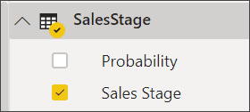
STEP 1: Start with a Blank Report PageTo create your Funnel Chart, you need to begin with a Blank Report Page. After that, you need to select Sales Stage and then click on the Sales Stage Field |
 |
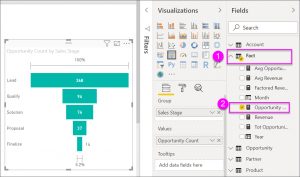 |
STEP 2: Transform your Column Chart into a Funnel ChartClick in the Funnel Icon that looks like this: . This will convert the Column Chart into a Funnel Chart. Then, on the Field Pane click Fact and then Opportunity Count |
STEP 3: Display Information and Save your ChartEach section of the Chart displays information, such as:
|
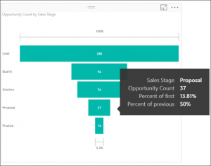 |
Finally, save your report and you are good to go!
Highlighting and cross-filtering your Funnel Charts
You can emphasize a bar or a section of your Funnel Chart if needed. If you want to highlight important information, you can add more visuals that contain the Funnel Chart to your Report Page.
STEP 1: Cross-highlight your visuals
Use CTRL to multi-select and click the Proposal Bar on your Funnel Chart. Highlighting a bar in a Funnel Chart cross-filters the other visualizations on the report page, and vice versa. To follow along, add a few more visuals to the report page that contains the Funnel Chart.
STEP 2: Set your preferences
To set preferences on how visuals cross-highlight and cross-filter each other, you can take a look at Visual interactions in Power BI.
With this, we conclude our Series of Funnel Charts!
Not as intimidating as it looked, is it? You can learn more about Data Visualization in Power BI on our website; please go ahead and take a look if you want to explore other Visualizations in Power BI. Moving on to the Pros and Cons of Funnel Charts, we have a list for you to look at before you decide which data visuals fit your company best.
Pros and Cons of Funnel Charts
Pros of Power BI Funnel Charts
- They are great for displaying linear processes
- They can show you the “Drop Rate” in every stage of the process you are visualizing
- Funnel Charts are easy to read and interpret
- They can expose the stages where there are bottlenecks
- You can highlight and cross-filter Funnel Charts in Power BI on a Report Page
Cons of Power BI Funnel Charts
- Funnel Charts don’t show detailed information
- If formatted incorrectly, they can be misleading
- Use funnel charts if you have a process with more than 3 or 4 stages; otherwise they are not very useful and you might feel the need to resort to other visuals

Finally: Microsoft Power BI Funnel Charts
We are closer to ‘Funnels’ than we think; take a closer look around you and you will find yourself in a Funnel of some sort at the moment. The very fact that you are reading this tutorial right now means that you are a part of our ‘Web Traffic Funnel Chart’ as well as a statistic.
Put simply: you are learning about Funnel Charts while being in a Funnel yourself!
At the end of the day, a good representation of your Data is fundamental to improve any process. Funnel Charts, Bar Charts, Column Charts or any other type of Chart needs to be used according to what you want others to visualize. Every time you click on something on the Internet, you are passing through a filter until you reach the bottom of a funnel; there is no easier way to explain how Funnel Charts work.
In addition, we sincerely hope that you enjoyed part 9 of our exciting series on Power BI Data Visualization Best Practices. In short we aim to provide quality service at all times. Moreover, if you need to reach me, you know how to get in touch by reaching out to me here. – Brandon Ahmad, founder of Instructor Brandon and Dynatuners.
If you wish to see more from our series, you can visit our website Instructor Brandon for more information. As always, we are available to help with any queries that you may have; leave us a comment in the section below and we will respond you ASAP.

 9412
9412 