Microsoft Power BI Series
Power BI Data Visualization Best Practices Part 11 of 15: Key Influencers Charts
“If you can’t measure it, you can’t improve it.” This is a very important statement, especially when it comes to Key Influencers Chart in Power BI
Something Peter Ducker, the man who invented management, would always say; and we believe it to be true.
Metrics are extremely important.They act as indicators for the different processes that happen within your business. With metrics, you can monitor performance or progress in order to improve those processes. These indicators happen to be so important that Power BI implemented its first AI-driven visualization type as Key Influencer Charts. This is why, to continue with our Power BI Data Visualization Series, we are going to dedicate this part of our series to them.
Without further ado, let’s begin.
In this article, we will cover:
- What are Key Influencers Charts in Power BI?
- How do Key Influencers Charts work in Power BI?
- Importance of Key Influencers Charts in Power BI
- Features of Key Influencers Charts in Power BI
- Common uses for Key Influencers Charts in Power BI
- Best Practices for Key Influencers Charts
- How to Create Key Influencers Charts in Power BI?
- Pros and Cons of Key Influencers Charts
- Finally: Key Influencers Charts in Power BI
What are Key Influencers Charts in Power BI?

Key Influencer Charts are a visualization type in Power BI driven by Microsoft’s Artificial Intelligence (the first one, as a matter of fact) that allows you to see what elements influence every metric you have.
But what exactly are Metrics?
Metrics are quantifiable measures commonly used to track the status of specific business processes. When it comes to Data Analysis, we have Metrics and KPI’s. Sometimes people confuse both terms and think that they are the same, but that’s not the case. Both are a measure, that’s for sure, but KPI’s are a measure that allows you to track whether you are effectively achieving business objectives or goals, and they have their own visualization type in Power BI.
In short: Metrics track business processes, KPI’s track goals’ achievement.
With all of that cleared up, let’s move on to Key Influencer Charts and their definition.
Key Influencer Charts, according to Microsoft, “help you understand the factors that drive a metric you’re interested in. These Charts analyze your data, rank the factors that matter, and display them as key influencers.”
To sum it up:
Driven by AI, Key Influencer Charts analyze all the elements that affect your metrics and provide insights of the factors that influence each one of them; displaying them as Key Influencers.
How do Key Influencer Charts work in Power BI?
We know that Key Influencer Charts in Power BI use Artificial Intelligence (AI) to analyze your business data and understand what influences a metric that you are interested in; it’s clear at this point. But in order to understand how this visual works, you need to know what drives it, which in this case is Artificial Intelligence (AI). Artificial Intelligence (AI) is the ability that computer systems have to make predictions using previously gathered data.
Key Influencers in Power BI use ML.NET (an open-source machine learning framework, created by Microsoft for the .NET developer platform) to reason over data and surface insights in an organic way.
Note: Machine Learning is an application of Artificial Intelligence.
By using Power BI, you can see what comes out of Machine Learning by shaping your data to show you the insight you are interested in.
For example, let’s say you want to know about your sales during the past month. You can use the Key Influencers in Power BI to analyze the gathered data and notice the patterns that affect the sales of specific products. Imagine you want to know why ‘red cups’ were your biggest seller last month, and by reading the Key Influencers, you realize that the new packaging was the main factor that drove the sales. Because of this information, you have the indicator that the new packaging was appealing enough to make people buy more cups. (I.e. The “new packaging” was the top key indicator).
Importance of Key Influencer Charts in Power BI
Key Influencer Charts can drive powerful insights. They are very useful for examining in-depth data through filtering. By doing this, you can help your team obtain insights by adding this layer-exploring feature to your Power BI Reports. Key Influencer Charts are important because you can segment all your data. By segmenting, you can determine which aspects have more impact on your metrics than others.
For example, we could segment in order to see what aspect is influencing our monthly costs the most.
But that isn’t all.
You can also use Key Influencer Charts to suggest actions or decisions by comparing the relationship between results and previous actions. For example, you can forecast how much you could be making on the sales of a particular product based on comparisons of previous sales.
Features of Key Influencer Charts in Power BI
For this section, we are going to turn to Microsoft; after all, who better to explain about Key Influencers’ features than the experts themselves?
| Feature | Description |
| Tabs | You can select tabs to switch from different views. Key influencers show the top contributors to the selected metric value. Top segments show you the most relevant factors that contribute to the selected metric value. A segment is made up of a combination of values. |
| Drop-Down Box | This allows you to look at the value of the metric you are analyzing. |
| Re-statement | With this feature, you can interpret the visuals in the left and right panels. |
| Left Pane | It usually contains a visual. So, in this case, it would be the top key influencers list. |
| Right Pane | In this case, it displays all the values for the key influencer theme that was selected in the left pane. |
| Average Line | This is calculated for all possible values for your theme, except for the selected influencer. |
| Check Box | With this feature, you can filter out the visual in the right pane to only show values that are influencers for a specific field. |
Common Uses for Key Influencer Charts in Power BI

Key Influencer Charts are great in two particular scenarios: First, when you want to know which factors or variables affect the metric you are analyzing. Second, when you want to compare how relevant these factors or variables are. Consequently, in order to continue, we are going to mention the most common uses for Key Influencer Charts in Power BI with some examples.
1. Interpret Categorical Key Influencers
Categorical Key Influencers are metrics that reflect positioning values, like ratings or rankings. When it comes to interpreting categorical key influencers, companies usually do the following:
Top Single Factor
The most impactful aspect that affects your metric (yet, not the only one). For example, if you want to know what makes people buy your ‘strawberry ice cream’ the most, you might find out that that ‘flavor’ is the top single factor. Other flavors might drive sales, but not as much as the ‘strawberry ice cream.’
Second Single Factor
The second most impactful factor helps you by providing a better insight into your data. For example, if the main reason people buy your ‘strawberry ice cream’ is ‘flavor,’ then the second one might be ‘packaging.’ With this information, you can determine a better strategy and make the respective changes you need to, in order to increase your revenue and improve your performance.
2. Interpret Continuous Key Influencers
You can explore continuous factors or variables with Key Influencer Charts in Power BI such as age, height or price. For example, your report could show that the longer your customers have bought your products, the more they buy from you. In this case, the continuous factor is the time they have been your customers; or brand loyalty.
3. Interpret Measures and Aggregates as Key Influencers
Another common use in Key Influencer Charts using Power BI is to add measures and aggregates as explanatory factors in your analysis. This is useful when you want to see how much a measure affects certain results.
4. Interpret Top Segments
Key influencers can be used to assess each individual factor. The top segments tab shows a combination of the factors that affect the metrics you are analyzing. Top segments normally display the overview of all segments that Power BI gathers, and these segments are ranked by their percentage.
Best Practices for Key Influencer Charts
Some of these are general suggestions for your Microsoft Power BI Data Visualization projects, but they are worth taking into consideration for making your Key Influencer Charts with Power BI Reporting tool.
-
Avoid too many elements in your Key Influencer Chart
If you keep a limit of elements per chart and their interactions with other charts, you could improve your Power BI report performance.
-
Remember Data Sensitivity Labels
With these labels, you can set how reports are shared based on security measures. These labels are High Business Impact (HBI), which needs a policy exception to share outside your company, and Medium Business Impact (MBI), and Low Business Impact (LBI), which do not need a policy exception.
-
Remember testing your Key Influencer Chart
Always try testing your report’s quality of performance before actually using it, when the time comes.
-
Keep complex measures to the bare minimum
Instead of calculated columns, you could go for creating calculated measures. Try pushing them closer to the source for better performance.
-
Add only necessary data to your Key Influencer Chart
Make sure you only import the fields and tables you need, instead of entire databases. The leaner your model is, the better it comes out as.
-
Cache update frequency
It would be great for you to set your cache update frequency at the same interval of time than your data source research frequency.
-
Light background color for your Key Influencers Charts
We recommend you design your Key Influencer Charts with a white or light color background. This way, it is better for printing your report on paper.
-
Templates are a great option
You could use templates (.PBIT files) to speed up and standardize your entire process. You can add your own business brand elements and adapt those templates to your own requirements.
IN SHORT:
- Avoid too many elements in your Key Influencer Charts
- Remember Data Sensitivity Labels and testing your Charts
- Keep complex measures to a bare minimum
- Add only necessary data to your Key Influencer Charts
- Use Light background color for your Key Influencer Charts
How to Create Key Influencer Charts in Power BI?
Creating Key Influencer Charts in Power BI is extremely simple; follow these steps and you’re good to go:
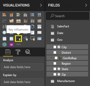
STEP 1: Select Key InfluencersSelect the Key Influencers option in the Visualizations panel. |
 |
 |
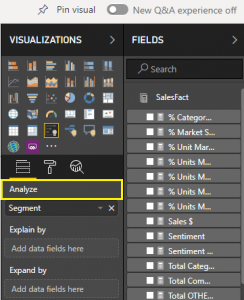
STEP 2: Select the dataThen, you select the data you want to analyze by placing it in the Analyze field. This allows you to access specific fields, like Company, Customer Table, Geography, etc. |
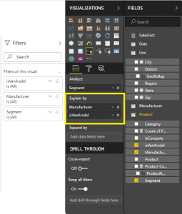
STEP 3: Add the FieldsAfter that, you can add fields that might influence your data into the ‘Explain By’ section. These are even more detailed categories and variables. |
 |
 |
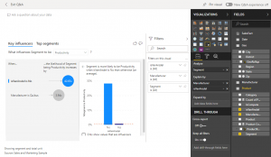
STEP 4: Go over the key influencersFinally, you can see the analysis of the factors you selected and go over them quickly. |
Note: You can adjust the format using the formatting options.
Now, let’s take a look at the pros and cons of Key Influencers Charts in Power BI.
Pros and Cons of Key Influencers Charts
Pros of using Key Influencer Charts:
- It allows you to easily organize our data in hierarchies based on in-depth information
- You can analyze relationships between many factors
- It allows you to include detailed reasons in order to understand trends or changes
Cons of using Key Influencer Charts:
- There is no support for Direct Query
- No supported connection to Azure Analysis Services and SQL Server Analysis Service
- Publishing to the web is not supported
- You need a .NET Framework higher than 4.6
- SharePoint Online embedding is not supported
Finally: Key Influencer Charts in Power BI
So, there you have it!
Key Influencer Charts are a great resource to count on if you need to know more about where your metrics come from.
At InstructorBrandon.com, we organize our courses in a need-based, customized manner so you get the most out of the time and effort you put into your training. We offer real-world based learning to help you get an accurate understanding of how your industry works. Take a look at courses and blog if you want to continue learning about Microsoft’s Multiple Platforms
In addition, we sincerely hope that you enjoyed part 11 of our exciting series on Power BI Data Visualization Best Practices. In short we aim to provide quality service at all times. Moreover, if you need to reach me, you know how to get in touch by reaching out to me here. – Brandon Ahmad, founder of Instructor Brandon and Dynatuners.
Thank you so much for reading; you are welcome to leave us a comment in the section below. See you next!
[sc_fs_multi_faq headline-0=”h3″ question-0=”What is Key Influencers Data Visualization?” answer-0=”Key Influencer Charts are a visualization type in Power BI driven by Microsoft’s Artificial Intelligence that allows you to see what elements influence every metric you have. Read more in our Blog ” image-0=”” headline-1=”h3″ question-1=”How do Key Influencers work in Power BI?” answer-1=”Key Influencers in Power BI use ML.NET to reason over data and surface insights in an organic way. Read more in our blog ” image-1=”” headline-2=”h3″ question-2=”When to use Key Influencers in Power BI?” answer-2=”You can use Key Influencer Charts in two particular scenarios. Read more in our blog ” image-2=”” headline-3=”h3″ question-3=”Why use Influencers in Power BI?” answer-3=”They are very useful for examining in-depth data through filtering. Read more in our blog” image-3=”” headline-4=”h3″ question-4=”What are the cons of using Key Influencers in Power BI?” answer-4=”There is no support for Direct Query and no supported connection to Azure Analysis Services and SQL Server Analysis Service. If you want to know more pros and cons of using Key Influencers Charts visit our blog ” image-4=”” count=”5″ html=”true” css_class=””]
 4778
4778 
